
Hello all, I would like to share a list of guidelines for the UI design and development of web applications.
Buttons:
Should be flat, rectangular with rounded corners. Unless specified otherwise in the requirements.
The color of the buttons should match the color scheme of the website. For example, Flexi Leasing has Orange and Blue colors. Keep the the button colors in Blue & Orange.
Example:
![]()
No gradient colors to be used for the buttons.

Unless specified in the requirements, use buttons for all actions (for ex. Save, Submit, Cancel) and navigations (for ex. Next, Previous, Home) instead of icons.
Consistency:
Be consistent in your designs, position (placement) of the controls, size of the controls, size of the text, usage of logos etc.
Examples:
If you are keeping Next Button in the right bottom most area of the screen, have this button at the same place in all pages.
If you are keeping a button for actions, keep the buttons for all actions. Do not mix icons and buttons. Users will get confused.
Alignment:
Ensure that the alignment of texts, controls are proper. Misaligned text or controls reflect poorly on the developer / designer’s skills.
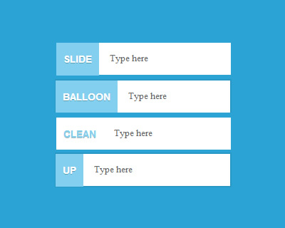
Placeholder Text:
For any text input fields where user is supposed to enter value, show an example value in the field or the a very brief description of what needs to be entered there. This is much better than leaving a blank input field or a generic “type here” / “Enter value” kind of text.

Case:
Pay attention to the usage of case for messages / text. Consistency guideline applies here. If you are using all upper cases, then, have all upper cases all over. It will be either all upper or mixed case.
Consult the project requirements if you are in doubt.
Grammar, punctuation & spelling:
- Wrong usage of tense, -ing forms must be avoided.
- Use appropriate punctuations. There is always a space after a comma, period or a colon/semi colon.
- For US customers, ensure that you are using American spelling and not UK / Indian spelling. Examples:
- it should be color and not colour
- it should be favor and not favour
- it should be center and not centre.
Decimals:
Wherever you are displaying currency value, have two decimals. Even if there is no cents, paise, show .00. For example, $34.00.
For fields which are supposed to show integers, like no of weeks, months, days, no of payments, show only the number without the decimals. 78 Weeks, 12 Payments. 78.00 payments will look odd.
Communication:
- Messages – Have standard messages displayed for error situations which are not a result of simple field validations. As much as possible, decode the error message and display a meaningful error messages which will make some sense to the users and guide them to take some action. For example, “We have some trouble processing your request. Please contact us for further processing at xxx-xxx-xxxxx” would be much better instead of “Error Processing your request”.
- Progress Indicators / Loaders: On clicking of a submit, save or any other action buttons, if it is going to take more than half a second, show a progress indicator. But, be consistent in using the indicators. Don’t leave the user guessing whether anything is happening or not. Few examples are given below.


Navigation:
Whether it is a web application or a website, the desgin should guide the user from entering the application to exiting the application.
Breadcrumbs, Menus, Links should be used to achieve the above objective. This will be changing from project to project and the specific project requirements should be used to design the user navigation.
Useful References:
There is a ton of websites / forums that talk about the UI design aspects. Here are the links to some of the useful ones:
Specky Boy, DesignModo, Creative Blog, MSDN, Awwards
Hit the comments and share your thoughts.
ps3 free codes
January 20, 2017 — 1:50 pm
Hi there colleagues, good article and good urging commented at
this place, I am really enjoying by these.